Measurements
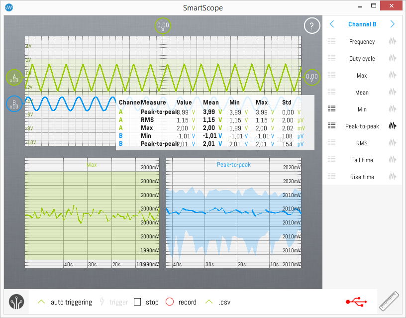
Since v0.13.0.0, the SmartScope includes a more advanced Measurement subsystem. Each measurement now shows more information (min/max/mean/std), and you can even watch how these values change over longer periods of time (even hours!) inside the SmartScope app itself.
Overview
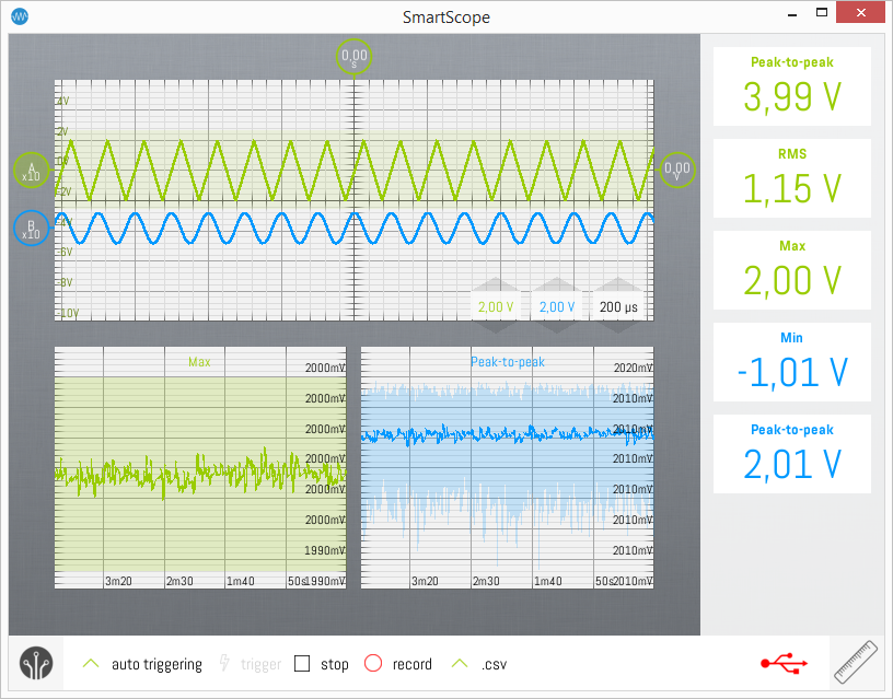
The main GUI elements of the measurement subsystem are shown below, which will be used throughout the remainder of this page:
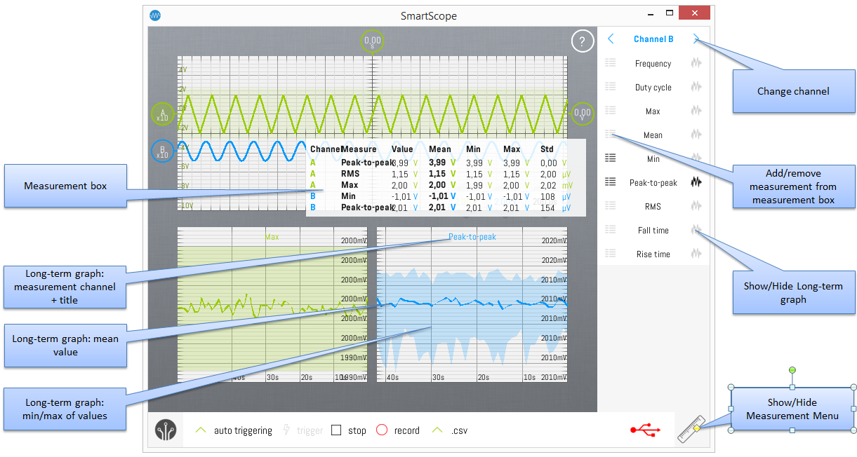
The Measurements menu is used to show/hide measurements. The Measurements menu is integrated in the right part of the GUI. To open or hide the Measurements menu, hit the Ruler button at the bottom-right of the screen.
Once opened, the Measurement menu shows at its top the channel, followed by the measurements which can be invoked for this channel. Cycle through the channels by tapping the '<' and '>' buttons next to the channel name.
Measurement box
The measurement box contains the currently active measurements. The Value column displays the value calculated on each incoming wave. This value can vary very rapidly, and therefore the Mean column was added which shows the averaged value over 1 second. Added to this are the Min and Max columns, which show the minumum and maximal value of the measurement of said 1 second period. Finally, the Std column shows the standard deviation (~noise or variation) of this value over the 1 second interval.
The measurement box can be dragged around freely over the screen.
Showing/hiding the measurement box
By dragging the Measurement box out of the screen through the top or left side of the screen, it will be removed from the screen.
To show the measurement box again, simply open the Measurement menu. If the Measurement menu was already open, simply close and open the menu by tapping the ruler twice.
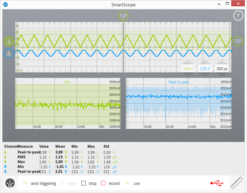
Docking the measurement box to the bottom of the screen
Typically the measurement box will be floating on top of your screen; and even though it is semi-transparant it can hide some parts you want to keep an eye on. Therefore, you can dock the measurement box to the bottom of the screen, which will make sure it no longer obscures other elements.
Docking the measurement box to the right side of the screen
Sometimes you're really only interested in the mean value of the measurement. For such cases, you can dock the measurement box to the right side of the screen, which will show the mean value in a much larger font. This can also be useful if you want to monitor a certain value from a distance.
Adding/removing measurement to/from the measurement box
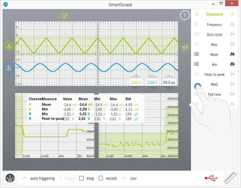
To add a measurement for a certain channel, follow these steps:
- Open the Measurement menu (by tapping the ruler at the bottom-right corner)
- Cycle to the desired channel (by tapping the '<' or '>' bottons at the top-right of the screen)
- Find your measurement, and hit the list icon to the left of the measurement's name
This will darken the list icon, and add the measurement to the Measurement box.
To remove the measurement again, repeat the same procedure which will gray out the list icon, and remove the measurment from the Measurement box.
Long-term measurement graphs
Sometimes you want to monitor a value over a long time. Using the long-term measurement graphs, this can now be done from within the SmartScope app.
In order to add the long-term graph for a measurement, follow these steps:
- Open the Measurement menu (by tapping the ruler at the bottom-right corner)
- Cycle to the desired channel (by tapping the '<' or '>' bottons at the top-right of the screen)
- Find your measurement, and hit the wave icon to the right of the measurement's name
This will darken the wave icon, and add the long-term graph of the measurement to the bottom of the main screen.
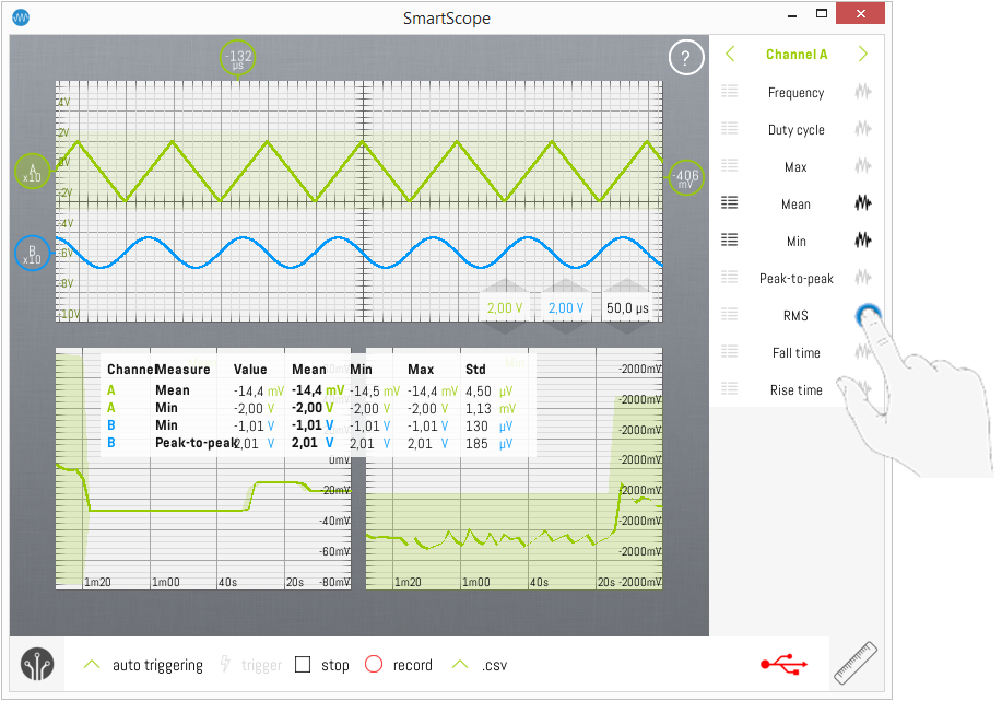
Each long-term graph presents the following information:
- Top-center: measurement title + color of the source channel
- x-axis: time axis (see below)
- Main trace: Mean value of that measurement
- Colored background behind trace: for each time-interval only the Mean value is shown on the main trace; but sometimes you need to follow the outliers as well. To this end, the colored background represent the Min and Max values of each interval.
Extending the timebase of the long-term channel graphs
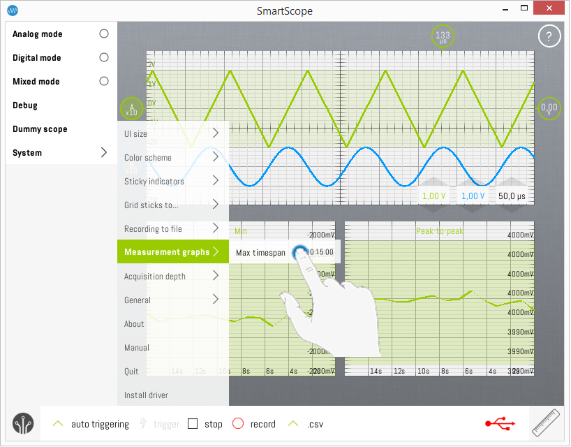
By default up till 15 minutes of data will be shown on each long-term graph. This can be increased to any length you prefer, but keep in mind the lenght of the interval after which a new datapoint will be added to the graphs will increase.
To do so, follow these steps:
- Open the main menu
- Go to System -> Measurement graphs and tap on the current timespan
- Enter any timespan you want through the keypad
!!Warning: changing the timespan of the long-term graphs will clear all data of all active measurements!!
