Main menu: Difference between revisions
(Created page with "Before starting designing the SmartScope app, we wanted to break with the typical oscilloscope interface. There is no reason to have a dark screen, or a plethora of knobs and...") |
mNo edit summary |
||
| Line 1: | Line 1: | ||
Before starting designing the SmartScope app, we wanted to break with the typical oscilloscope interface. There is no reason to have a dark screen, or a plethora of knobs and buttons. Instead, we wanted to focus on having a clean and simple UI, yet capable of storing all of the complex functionality available in traditional oscilloscopes. | Before starting designing the SmartScope app, we wanted to break with the typical oscilloscope interface. | ||
There is no reason to have a dark screen, or a plethora of knobs and buttons. Instead, we wanted to focus on having a clean and simple UI, yet capable of storing all of the complex functionality available in traditional oscilloscopes. | |||
Therefore, '''most of the functionality is integrated in each physical element'''. For example: if you want to change trigger settings, simply click/tap the trigger indicator on the right of the screen. More general settings have been moved into the menu, which is hidden by default in order to free up as much as possible screen space for the graph. | |||
This '''main menu can be opened and closed by tapping on the LabNation logo''' in the bottom-left. | |||
<br><br> | <br><br> | ||
[[File:MainMenu.png]] | [[File:MainMenu.png]] | ||
Latest revision as of 12:02, 9 November 2015
Before starting designing the SmartScope app, we wanted to break with the typical oscilloscope interface.
There is no reason to have a dark screen, or a plethora of knobs and buttons. Instead, we wanted to focus on having a clean and simple UI, yet capable of storing all of the complex functionality available in traditional oscilloscopes.
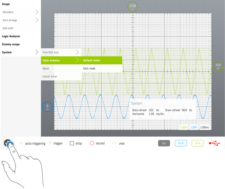
Therefore, most of the functionality is integrated in each physical element. For example: if you want to change trigger settings, simply click/tap the trigger indicator on the right of the screen. More general settings have been moved into the menu, which is hidden by default in order to free up as much as possible screen space for the graph.
This main menu can be opened and closed by tapping on the LabNation logo in the bottom-left.
