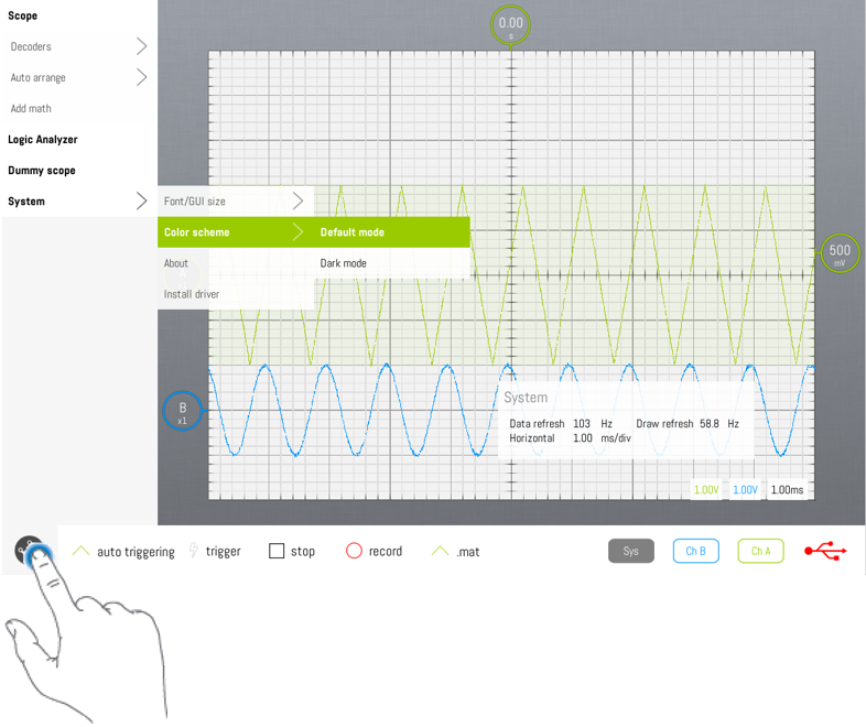
Main menu
Jump to navigation
Jump to search
Before starting designing the SmartScope app, we wanted to break with the typical oscilloscope interface. There is no reason to have a dark screen, or a plethora of knobs and buttons. Instead, we wanted to focus on having a clean and simple UI, yet capable of storing all of the complex functionality available in traditional oscilloscopes. One of the most difficult tasks was to come up with a menu which is simple, contains a lot of functionality, and have this functionality available in a small number of operations.
All of the functionality can be accessed through the main menu, which can be opened and closed by tapping on the LabNation logo in the top-left bottom.
